I released an R package over 9 months ago called geofacet, and have long promised a blog post about the approach. This is the first post in what I plan to be a series of two or three posts. In this post I’ll introduce what the package does and compare it to some other approaches for visualizing geographic data.
geofacet
The geofacet package extends ggplot2 in a way that makes it easy to create geographically faceted visualizations in R. To geofacet is to take data representing different geographic entities and apply a visualization method to the data for each entity, with the resulting set of visualizations being laid out in a grid that mimics the original geographic topology as closely as possible.
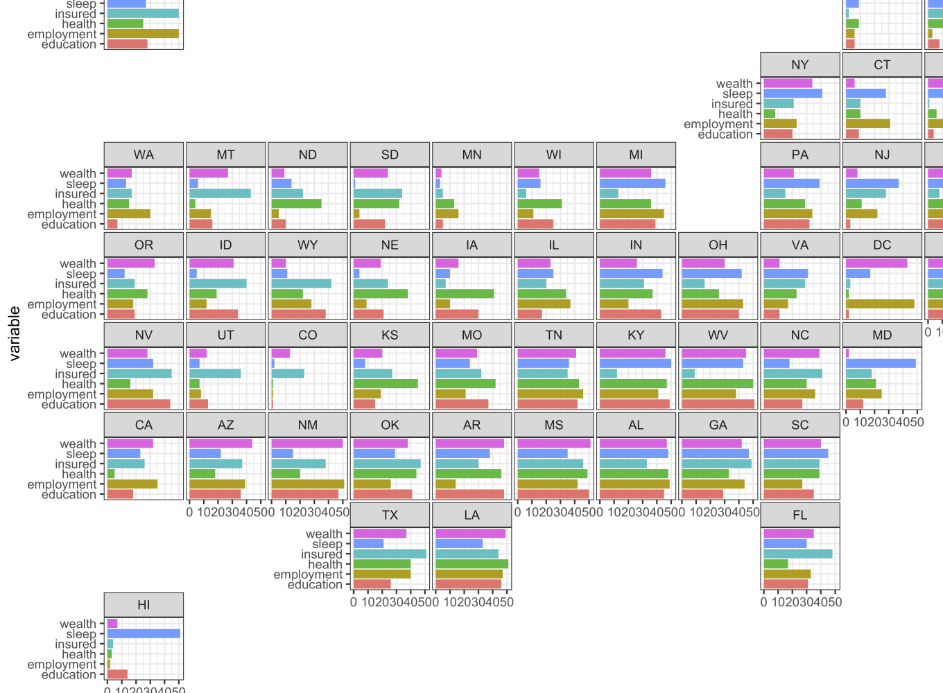
This idea is probably easiest to explain with an example. The visualization below shows a bar chart of the ranking of U.S. states in six quality-of-life categories, where a state with a rank of 1 is doing the best in the category and a rank of 51 is the worst (Washington DC is included). This data is based on data that comes from this article.
library(geofacet)
library(ggplot2)

ggplot(state_ranks, aes(variable, rank, fill = variable)) +
  geom_col() +
  coord_flip() +
  theme_bw() +
  facet_geo(~ state, grid = "us_state_grid2")

As can be seen, the U.S. states are arranged in a way that is familiar to the underlying geography, but each state gets equal space to have its data visualized in whatever way we might envision. Here, we use a bar chart to illustrate each of the 6 categories. States with very low rankings across most categories (HI, VT, CO, MN) stand out, and geographical trends such as the southern states consistently showing up in the bottom of the rankings stands out as well. Many interesting insights and questions come from spending some time looking at the plot.
There are many favorable aspects of this approach to visualizing geographic data. This article will talk about this approach in comparison to other approaches and will focus on methods rather than code. For a more technical introduction to the package and a full overview of how to use it, follow this link.
What’s New About This Approach?
The “geofaceting” approach itself isn’t new. There are many examples in the wild of this idea being applied in an ad hoc manner (here are some examples at the Wall Street Journal and the Washington Post). People have done this in R as well (see here for example). In fact, the idea for this package came from a colleague of mine, J Hathaway, while we were working together at PNNL 4 or 5 years ago. He will be writing a post about how the idea came about which I’ll link to when it’s up.
What’s new about this R package is that it formalizes the “geofaceting” approach, gives it a name, and makes it available in a user-friendly way. Also, it provides the basis for creating a library of community-contributed grids, which can be used elsewhere outside the package. Another post in this series will be about different ways to make your own grids.
Geofaceting vs. Other Approaches
There are many reasons why you might want to consider using geofacet vs. other approaches. Here I’ll describe a few alternative approaches. Note that geographical visualization is a well-explored area and the list of things I’m comparing to will not be exhaustive. If there is something major that I missed I’ll be happy to consider follow-up posts discussing those in comparison to geofaceting.
Choropleth Maps
A choropleth map plots the raw geographic topology and colors each geographic entity according to the value of the variable being visualized.
For example, suppose we want to visualize the 2016 unemployment rate for each state in the United States:

It is quickly evident which states have the highest and lowest unemployment. However, based on color alone, it is difficult to make quantitative comparisons. For example, how much lower is the unemployment rate in Oregon (OR) than in Washington (WA)?. Also, small states are more difficult to see, and the area of a state does not reflect its population, which might be an important context for this plot. Compare Massachusetts (MA) and North Dakota (ND), for example.
These plots can be created with the choroplethr R package, although it does not seem to be quite up to date with the latest version of ggplot2 as of this writing. You can also create these plots on your own, for example with ggplot2 or plotly or leaflet.
Disadvantages of Choropleth Maps
- Only visualize one variable and one value per entity: A major deficiency of choropleth maps is that they can only display a single value of a single variable for each geographic entity. What if we want to look at how the unemployment rate has changed over time for each state, or compare the raw vs. seasonally-adjusted unemployment rate?
- Only use color for visual encoding: With choropleth maps, the data are visually encoded only with color, and color is one of the least effective ways to visually encode information. In the example above, the use of color is helpful for getting a general feel for regions of high and low unemployment, but it is very difficult to make quantitative judgements of how different the unemployment rate is between different states.
- Favor large geographic entities: A well-known issue with choropleth maps is that they visually favor geographically large regions over small regions. It is very hard to notice what the unemployment rate is in small regions like Rhode Island or Washington DC. There are many ways to deal with this problem and we’ll see a few below.
Rectangular / Hex Tile Maps
To deal with the issue of choropleth maps favoring large geographic entities, we can translate the geographic topology into a rectangular or hexagonal grid, in the same way the geofacet package does, so that each geographic entity is represented by shapes of the same size. Rectangular / hex tile maps color the grid of rectangles or hexagons according to the value of a variable in the data. Some R packages that will create these plots include a recently-updated statebins package (see related post) and another one that makes more interactive plots but hasn’t been updated in a while, rcstatebin.
Below is a plot obtained from using statebins on the a 2016 unemployment data:

Here, we can now see Washington D.C. much better, for example.
Disadvantages of Rectangular / Hex Tile Maps
While hex / tile maps deal with the deficiency of choropleth maps that favor large geographic entities, they still suffer from the other two choropleth map disadvantages, namely only visualizing one variable and only using color to visually encode the information.
This NPR blog post provides a nice commentary for follow-up reading on rectangular and hex tile maps as well as choropleth maps.
Faceted Choropleth or Tile Maps
One suggestion for using choropleth or “statebin” charts to visualize multiple values is by faceting on the variables instead of the geography. For example, a case of this approach is shown in a 2014 Washington Post article about state workforces that are threatened by trade. The change in share of workforce over three time periods is illustrated as three statebin charts.
A reproduction of their plot is shown below:

While this approach may have a good use case in certain circumstances, it is generally visually not extremely effective because while we have already established that it is difficult to make judgements about differences in value based on color encoding within a map, it is even more difficult to judge differences in color when you have to compare across maps. But there are cases where this can be a useful approach.
Cartograms
Instead of using color to encode the values of the data, cartograms use size. Cartograms elarge or shrink a geographic entity based on the size of the related values of the variable being visualized.
For example, below is a screenshot for an interactive cartogram I created for a project I’m working on that displays the amount of different kinds of data that are available about countries in the world.

In this plot, countries that are large have more data available than those that are small. There is a lot of distortion, but hopefully it is evident that this is based on a map of the world.
Disadvantages of Cartograms:
- Too much warping: Maintaining geographic orientation becomes very difficult when things are really out of proportion. Above, without the help of tooltips, it would be extremely difficult to say what several of the countries are. Inside the interactive application represented by the above screenshot, animated transitions are provided between the original map and the cartogram, and this can alleviate the warping problem a little.
- Shapes are arbitrary: It is hard for the human to make comparisons of size based on arbitrary shapes. Ideally we would be using something like squares or rectangles if we wanted to be able to make comparisons of size across shapes.
- Doesn’t highlight both extremes: Often you want geographic entities with both very large and very small values to stand out on the same plot, which is difficult to do with cartograms as small values result in little to no space being used to represent the entity.
- Difficult to create: There’s not very good support for creating cartograms in R, and outside of R, it is difficult to find an easy-to-use tool that provides good results. There are a few R packages (cartogram, Rcartogram / getcartr, topogRam), but I’ve found most of them difficult to install and the results to not look the way I expect - perhaps due to user error.
Another cartogram option that deals with the “arbitrary shapes” disadvantage is rectangular statistical cartograms.
Tilegrams
Another interesting approach is the “Tiled cartogram”, or “tilegram”. Tilegrams use hexagons, but unlike hex tile maps, instead of using one hexagon to represent a geographic entity, multiple hexagons are used, with the number of hexagons representing the value of the variable being visualized.
Here is a screenshot taken directly from the “tilegramR” R package showing a tilegram of the 2016 US population by state.

Tilegrams are a nice option when wanting to visualize a single variable and when you care about using a larger area to represent larger values of the variable. A nice article about tilegrams can be found here.
Disadvantages of Tilegrams
Tilegrams have some of the same disadvantages of other approaches that we have seen before, namely that you can only visualize one variable at a time and that you want both large and small values of a variable to be clearly evident.
Tilegrams are also difficult to create. There is an R package for tilegrams, and you can read about using it here, but it only provides a way to plot pre-created tilegrams. You can’t create your own. To actually create a tilegram you have to use a base tilegram to begin with (there’s just US, Germany, and France) and then you have to upload some data in a predetermined format that’s not very well documented and then you still have to do manual manipulation of the result. So while the approach is generally good, the technology for creating tilegrams is not in a good state for use in quick exploratory analysis.
So Why is Geofaceting Useful?
By looking at some of the alternatives, hopefully some of the advantages of geofaceting are clear. These include:
- We can plot multiple variables or values per geographic entity – you can plot practically anything you can imagine inside each panel.
- We can use more effective visual encoding schemes than just color.
- Each geographic entity is given the same amount of screen real estate (although this may not be desirable in all situations).
- Faceting is in general a powerful visualization technique. People familiar with my work know how big a fan I am of this approach.
For example, we can use geofacet to improve on the 2016 unemployment rate plots above by using a bar instead of color to denote the unemployment rate. We can even go further and visualize how the unemployment rate has varied over time for each state:

When is Geofaceting Not Useful?
There are some cases when geofaceting might not be useful:
- Sometimes the original geography has entities that are so irregularly organized and have such large size disparities that it is difficult to represent it as a regular grid.
- Sometimes exact preservation of entity boundaries and neighbors is essential.
- A geofacet grid is only meaningful if the person already has an understanding of the underlying original geography. One way to help with this issue in the future would be to have the option for the original geography to be plotted as a reference alongside the geofaceted plot.
- Geofaceting is only useful for data that represents values recorded for different geographic entities. For example, geofaceting is not appropriate for geographical data representing a spatial point process.
Getting Started
If you have applications that might benefit from geofaceting, you can get started here!
Next Post
In a future post, I’ll talk more about the community library of grids and show you how to make your own grids.